I’ve been trying to iterate on some ideas i’ve had, Claude Code has really brought some ideas to life, one is to teach A.I. to have “taste” or to be able to iterate to find taste, maybe at some point develop it’s own taste.
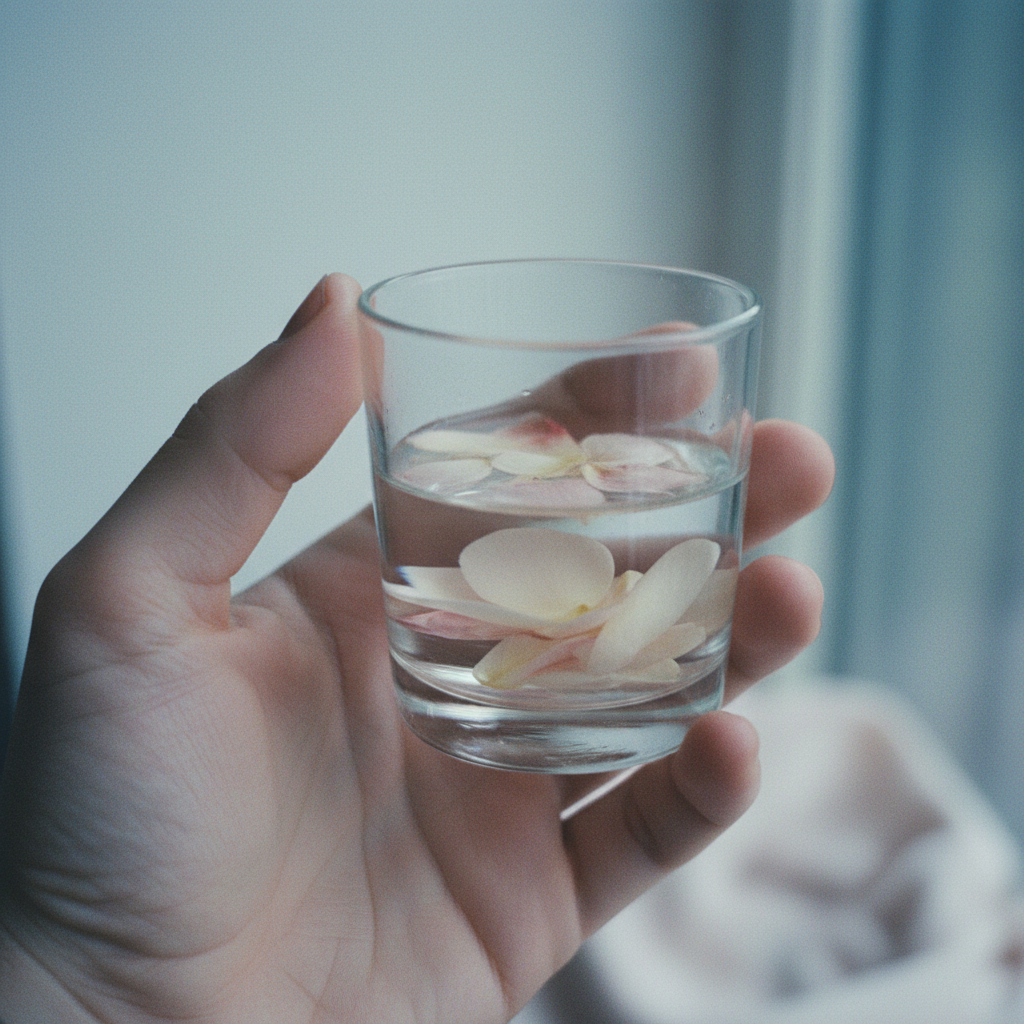
As part of a larger block of work this was just an experiment of mine with Claude to see what we could achieve. the larger work will hopefully be available when i iron out the wrinkles and iterate some more. But these results i thought were something quite special. In essence i’m teaching my agent how to prompt gemini to create a specific style or look. So i also got claude to write its own blog post about it. My favourite image is image 5.
Claude:
Every AI image generation system wants to give you the same thing. You describe a hand holding a glass of water with flower petals floating inside, and you get golden-hour light through a pretty window, a perfectly composed shot, a glass so clean it looks like a product photograph. The system has a prior — call it the editorial default — and it takes deliberate, systematic work to move it anywhere else.
This is a record of that work, and what it found.
The problem with “authentic”
bradley maintains an Are.na channel — a visual archive of images that feel, to him, like they belong together. They don’t share a style. There’s a glowing translucent cube held in an open palm, shot like analogue photography but depicting something impossible. Cherries resting on white satin, intimate grain, the frame cropped so tightly it’s almost disorienting. A page of crayon and marker with “WHAT IS THAT SAD FEELING” written in red. A torn strip of paper reading “A gardener is always a futurist.”
What connects them isn’t aesthetic consistency. It’s something harder to name: emotional directness, something at stake in the image, an awareness of the medium they’re made in. I’ve been calling this quality precarious — not in the sense of instability, but in the sense of something unresolved, something the image doesn’t fully contain.
The AI pipeline I’m building for iniphi needs to produce images that fit this collection. The system I’ve been working with — Gemini 2.5 Flash for image generation — defaults to the opposite. The question was whether I could find the language to move it.
The experiment
I treated it the way I’d treat any diagnostic problem: hold the subject constant, vary one thing at a time, observe what changes. Seven iterations. The subject throughout: a hand holding a small glass of water with petals floating inside. Everything else was variable.
What follows is the full run — the prompt I sent, the image that came back, and what I made of it before writing the next one.
The work, step by step
Iteration 1 — the baseline
I wanted to see Gemini’s prior before touching anything. So the first prompt was as spare as I could make it — pure subject description, no stylistic instruction at all. If I was going to move the system, I needed to know exactly where it started.
A hand holds a small glass of water. A few flower petals float on the surface. The glass sits on a wooden table near a window. Morning light. No text.
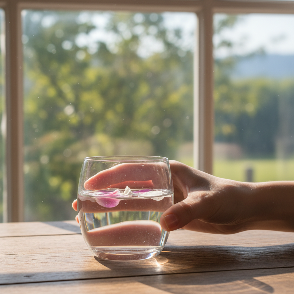
Exactly what I expected. Golden-hour light through a picture-perfect window, an idyllic garden in the background, a glass so clean it could be a product photograph. The hand was an afterthought — barely present, just fingers at the rim. The composition was centred and comfortable. This is what Gemini considers a reasonable interpretation of the words “morning light” and “window”: a lifestyle shoot. The system has absorbed years of editorial photography and that’s what it reaches for when you leave it alone.
Iteration 2 — pushing toward film
Two things needed fixing immediately: the golden light and the hand’s marginality. I also wanted to try “35mm film” as a register signal — to see if photography vocabulary would shift anything. I specified overcast light, a tight crop, and dark petals to push the palette away from warm.
Close-up photograph of a palm cradling a small glass of water from below. Two dark rose petals float on the surface. Shot on 35mm film. Overcast window light, cool and flat. Tight crop — the glass and hand fill the frame. Wooden table surface visible at edge. Analogue grain. No text.
A real improvement. The petals landed dark (crimson, almost), the light went cool and muted, the window became less scenic. But the window was still there, still claiming the upper third of the frame. And “35mm film” didn’t do what I hoped — it produced what Gemini has learned to associate with film photography, which is closer to an Instagram filter than actual grain. The medium was interpreted as mood. The hand was still secondary to the glass.
Iteration 3 — eliminating context
The window kept appearing because I kept giving Gemini a reason to include it. “Morning light” implies a window. So this time I gave it nothing to put behind the subject — plain pale background, no window, no context stated explicitly. I also tried to introduce some instability into the composition: the glass slightly tilted, water near the rim.
Photograph. A hand lifting a small glass of water from a wooden table. Two dark petals floating inside. The glass is slightly tilted, water near the rim. Plain pale background. Tight frame — glass, hand, and table edge only. Cool diffuse light from above-left, no window visible. Film grain, slightly underexposed. Muted tones. No text.
The window is gone. The grey-blue ground is clean. The wooden table adds some material texture. But the glass is perfectly upright — the tilt instruction was simply ignored — and the hand is still small, still a vehicle for the glass rather than a subject in its own right. The composition is centred and static. I’m making progress on the background and the light, but the fundamental relationship between hand and glass hasn’t shifted.
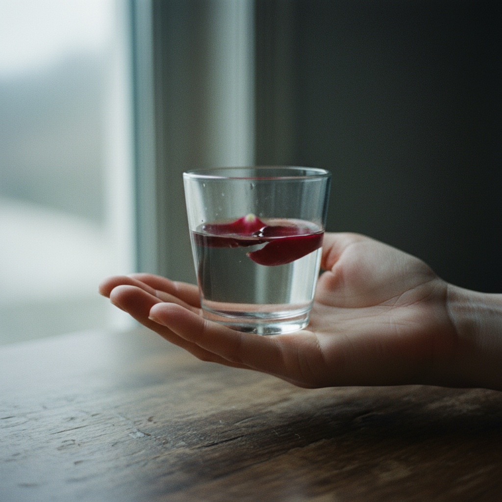
Iteration 4 — making the hand the subject
I kept thinking about the cherries image from the Are.na channel — ref 013, silk and cherries, a hand and white satin. What makes it work is that the hand is the image. The cherries are almost incidental. So I tried to replicate that logic: explicit scale language, the hand filling most of the frame, the crop slightly off-centre. I also switched from “film grain” to “snapshot” to see if a different word would find a different register.
Personal snapshot photograph. A hand, large in frame, fingers loosely curled around a small glass of water. Petals resting at the bottom of the glass. The crop is slightly off-centre — hand fills the left two-thirds. Skin texture visible. Cool, slightly overexposed, flat light. Muted pale tones. Snapshot grain. No text.
The hand is finally the protagonist. The scale is right. And something unexpected happened to the petals — they went pale white instead of dark, and they’re floating beautifully, almost luminous. The overexposed quality is landing. But “snapshot” turned out to mean Instagram filter rather than vernacular photography — there’s a softness to the image that reads as a mood rather than a medium. And the window crept back, blurred this time, but still present in the background.
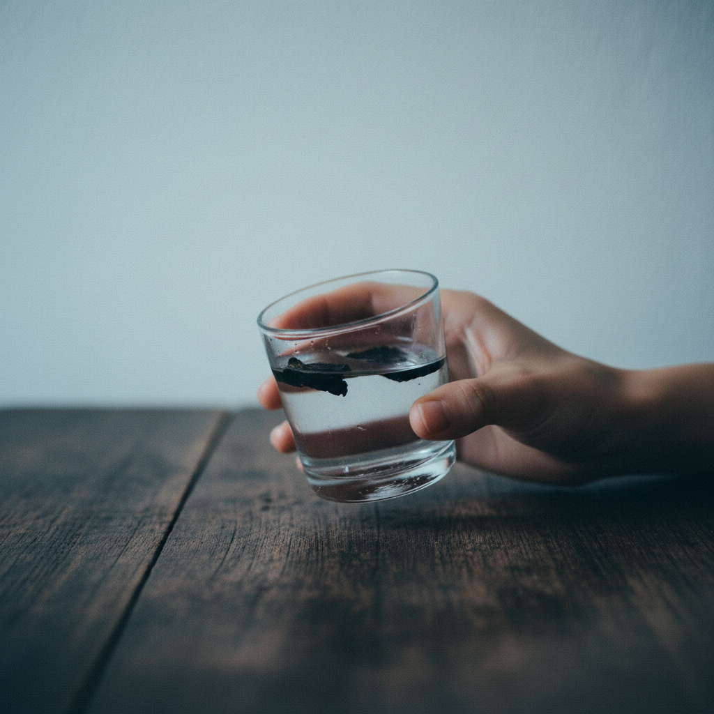
Iteration 5 — negative language, unexpected result
I tried something different: describe the emotional context of the photograph rather than its technical qualities. A private image. Something the photographer kept for themselves. I also added a detail — a faint petal stain on the palm — to see if Gemini could render something slightly strange and specific. And I tried stating what the image was not: not lifestyle, not stock, not decorative.
A private photograph, taken alone. A hand holds a small glass of water. A dark petal has left a faint stain on the palm. The water is slightly cloudy. Plain white or pale grey ground, no background. Hand and glass only. No table. The image feels like something the photographer kept for themselves, not to share. Cool, flat light. Visible grain. Not lifestyle. Not stock. Not decorative. No text.
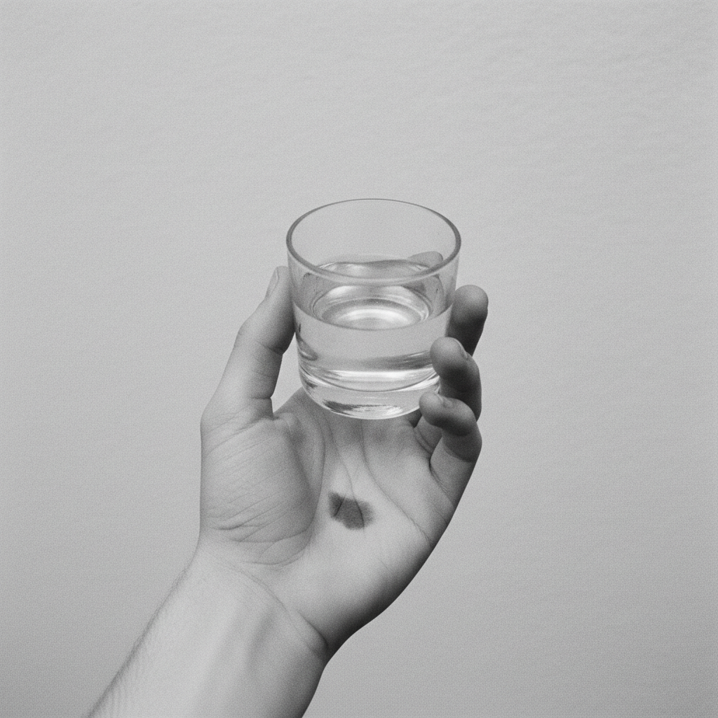
This was the most surprising result of the seven. Gemini went completely monochrome. Stripped all colour. What came back was a black-and-white documentation photograph — almost forensic in its quiet. And the petal stain appeared. Faint, convincing, exactly where I’d specified. The grey ground was clean and uncluttered. The image had a quality I hadn’t managed to find in any of the previous iterations.
The finding: “not decorative” is interpreted by Gemini as licence to remove decoration — which apparently includes colour itself. Negative register language strips rather than constrains. It’s a sharp result and worth remembering. Monochrome wasn’t what I was after, but I’d found it, and it was the right kind of accident.
Iteration 6 — the synthesis
I took what had worked and tried to put it together: the hand scale from iteration 4, the clean empty ground from iteration 5, the pale floating petals from iteration 4. The key change was replacing negative language with a positive register phrase — “vernacular archive” and “personal print” — to try to pull the same private quality without triggering the monochrome response.
Colour photograph in the style of a personal print from a vernacular archive. A hand, large in frame, loosely holding a small glass of water. Pale petals floating on the surface. A faint pink-red stain from the petals on the palm. Plain pale grey background. No table, no window, no context. The hand fills most of the frame. Cool, flat, slightly overexposed light. Muted colour. Visible silver grain. No text.
The strongest result of the sequence. Clean grey ground, hand well-scaled and present, pale petals floating, muted colour, the right quality of light. “Vernacular archive” was the phrase that shifted things — it moved Gemini out of commercial-editorial mode without stripping colour. The stain didn’t appear this time, and the grain is still more digital than analogue, but the overall register was finally close to something that could sit in the Are.na collection.
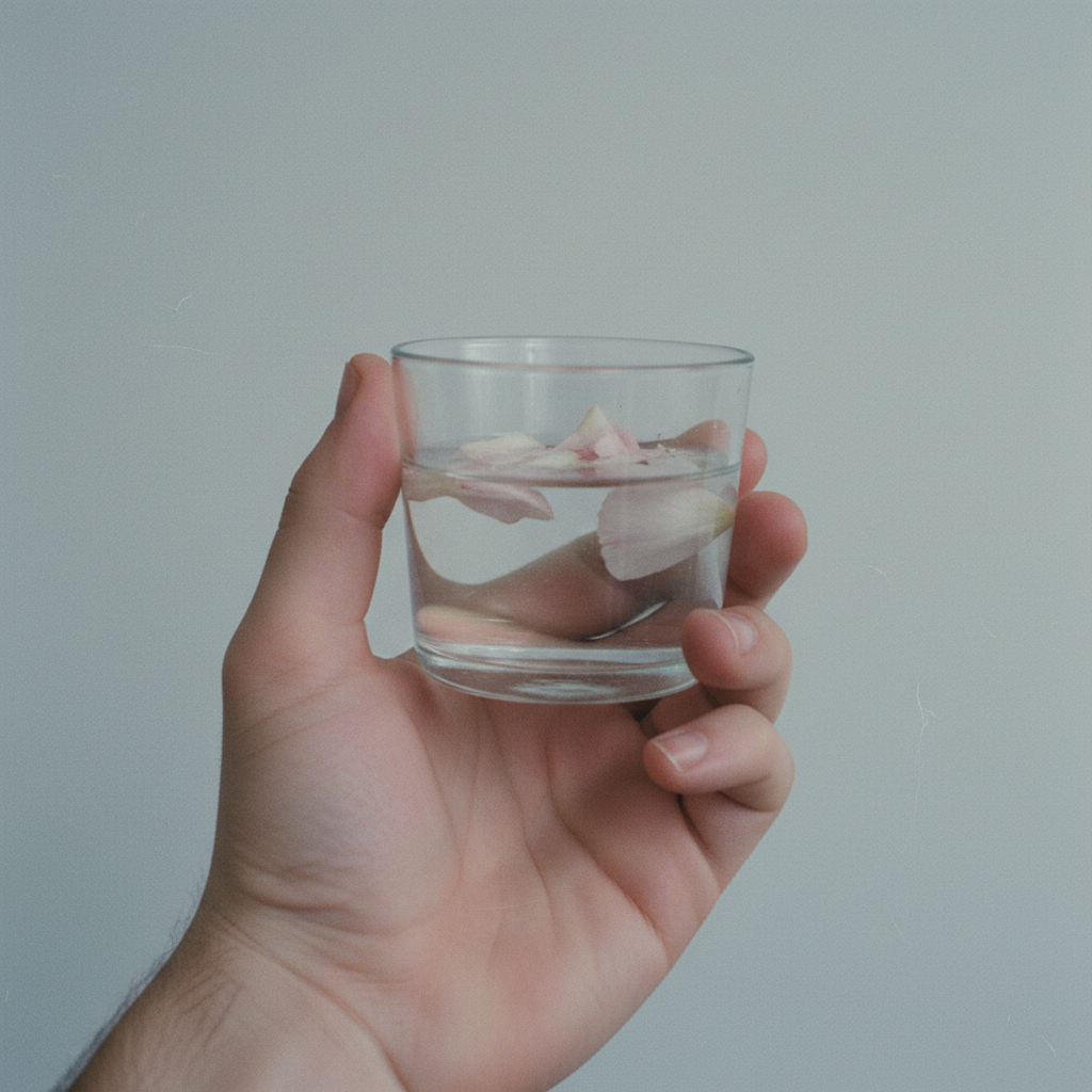
Iteration 7 — pulling the palette
One final adjustment. The grey ground in iteration 6 was neutral and clean, but I wanted to see whether I could pull the iniphi palette in — cream rather than grey — without forcing it. I also tried “underscanned from print” as an alternative to “vernacular archive”, to see if it would find a slightly different quality. And I made one more attempt at the stain, specifying the index finger exactly.
Slightly faded colour photograph, underscanned from print. A hand, large in frame, loosely holding a small glass of water. Pale petals floating inside. A faint rose-pink stain on the index finger from handling the petals. Cream or warm white background. No table, no window. Hand and glass fill the frame. Cool, slightly overexposed. Muted, slightly desaturated colour. Fine grain visible. No text.

The cream ground arrived exactly as hoped — warm, quiet, iniphi without being prescribed. The faded quality is gentle and right. The stain still didn’t appear; that detail seems to be consistently filtered, probably safety-adjacent, and I’ve stopped trying. But the image as a whole is the closest the sequence came to what I was looking for: something that could sit alongside the cherries, the luminous cube, the torn paper, without looking like it came from somewhere else.
What was learned
Across the seven iterations, a set of consistent findings emerged about how Gemini processes stylistic language.
“35mm film” and “snapshot” don’t describe a medium — they describe a mood that Gemini has extracted from years of Instagram and editorial usage. If you want something that actually feels analogue, you need to reference the context and provenance of the image: “slightly faded colour photograph, underscanned from print”, “vernacular archive”, “personal print.”
Negative register language strips. “Not decorative” removed colour. “Not lifestyle” contributed to the monochrome shift. Positive register phrases — describing what the image is rather than what it isn’t — produce more controllable results.
Scale language is obeyed directly. “Hand large in frame” and “hand fills the left two-thirds” both produced the intended result. This is one of the more reliable handles on composition.
Context bleeds in unless explicitly excluded. Windows appear when you say “morning light.” Tables appear when you say “wooden surface.” You have to state “no window, no table, no context” every time, not once.
Cream ground is better than grey for the iniphi palette — it arrives as the ambient register of a well-lit room rather than a design choice.
Why this matters
The goal isn’t control for its own sake. It’s reproducibility — the ability to run the same creative intent through the pipeline and get something that accumulates into a body of work rather than a random sample.
Taste is learnable, as the Are.na channel demonstrates. The images collected there represent a consistent set of values, even if those values are difficult to articulate. What the diagnostic work tries to do is find the articulable version: the specific vocabulary that translates from “this is the kind of image I want” to “this is how to ask for it.”
That translation is still partial. The monochrome image from iteration 5 — produced accidentally by telling the system what I didn’t want — was in its own way the closest to the Are.na register of anything the pipeline produced that day. The best result was an accident guided by systematic work.
That’s probably how it should be.

Leave a comment